Major website update

Our target is always to make ochsundjunior.swiss better reflect the rigorous simplicity of Ludwig Oechslin’s watches.
Following ochs und junior’s recognition as one of the three best watch company websites, today we’re launching several updates to our website:
- The watch company with no logo on its watches now has no logo on its website. We simply write the company name in Helvetica Neue, the font we have used since relaunching the site in November 2012. This loads faster in your web browser (it is simply text) and is just as easy to read for you as it is for search engines.
- The tagline is now “watches by ludwig oechslin” instead of “rigorously simple watches by Ludwig Oechslin”. With the new design, we’re taking the next step towards rigorous simplicity.
- The grey lines in the header and footer have been removed. With everything in the header and footer now in a straight line and using the same font, just space is sufficient to set apart the header and sub-header.
- Every font size has been tweaked. Our typical line length is now 66 characters. If a line of text is too long, it is tiring for the eye to track. If a line of text is too short, the eye begins to feel like the carriage return on a typewriter. Robert Bringhurst writes “the 66 character line (counting both letters and spaces) is widely regarded as ideal” in the English Bible of typography, The Elements of Typographic Style.
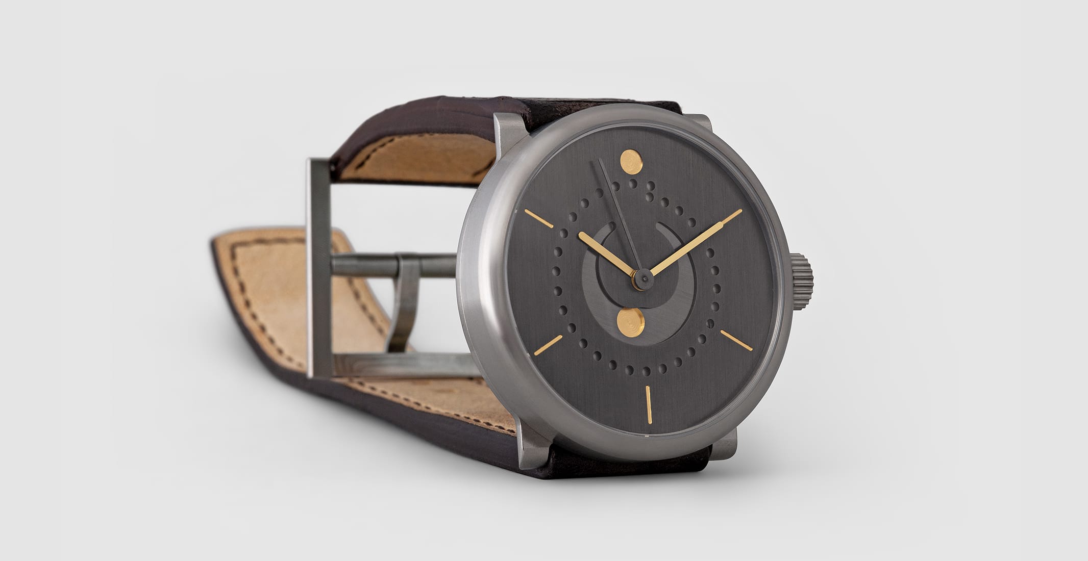
- Nearly every picture has been updated, rescaled, or re-cropped. Every picture is still Retina-resolution (as it has been since we relaunched the website in 2012).
- An “overview” page for each watch. For example: moon phase.
- Some links use the color #0088CC for greater visibility.
- Lucerne is our city, and we find her very beautiful. Space has been created for broader and deeper Lucerne content. Look for more updates before the end of the year.
- We have cleaned up several small details.
We appreciate your feedback.