Edgar’s question
Edgar wrote to us as follows:
“Beat – Does the design of ochs und junior watches still take account of Dieter Rams’ ten principles of good design [1) innovative, 2) useful, 3) aesthetic, 4) understandable, 5) unobtrusive, 6) honest, 7) long-lasting, 8) thorough, down to the last detail, 9) environmentally-friendly, and 10) as little design as possible]? I think so – it’s my mese in a nutshell. ;-)”
(Facebook)
Design? What is its significance to ochs und junior?
During Baselworld 2010 Ludwig Oechslin and I sauntered through the exhibition halls and philosophised about the design of the new watches. Oechslin: “It seems to me that a certain degree of arbitrariness has crept into the design idiom these days. The form of display changes for little or no reason. Anything is possible! I observed this phenomenon when working on the Freak.”
In the case of complications and the ensuing design, a lot is more, and more has a greater effect. Oechslin does things differently! For him, there is beauty in function. Elegance is when there is clarity and the watch is useful...
Now to Edgar’s question. We think that Ludwig has created a distinct design idiom for ochs und junior. The mese, like almost all the others, is shorn of any form of alphanumeric information…
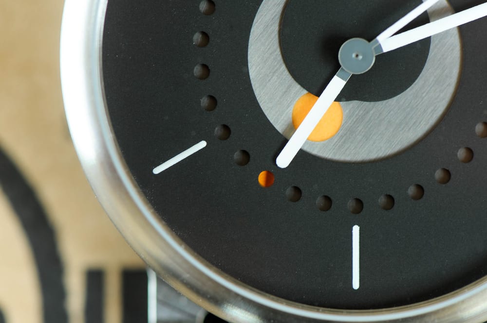
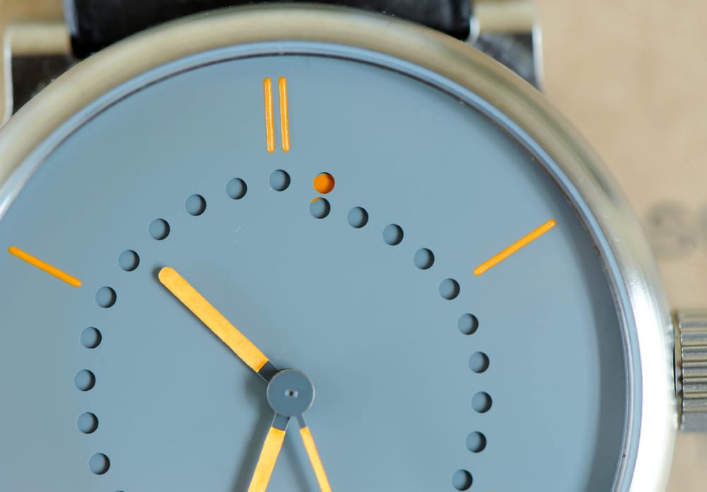
… while the selene is an example of how the perforations and shape of the hands and indices express the brand.
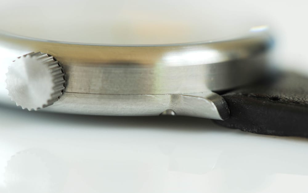
A glance is enough to tell you that these are ochs und junior watches. Most watches need a logo so you can tell the brands apart.
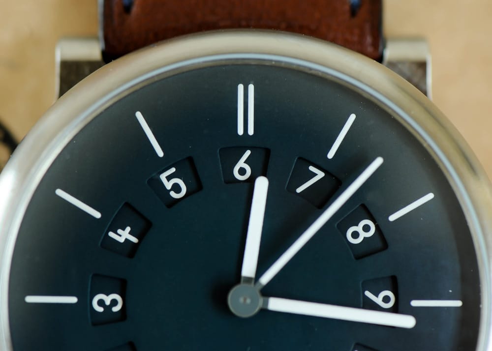
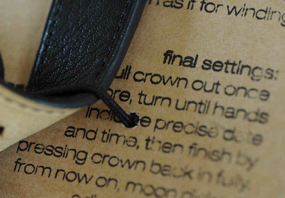
Exceptionally, the due ore has a numeric display for its alternative time zone, which is simplicity itself to use.
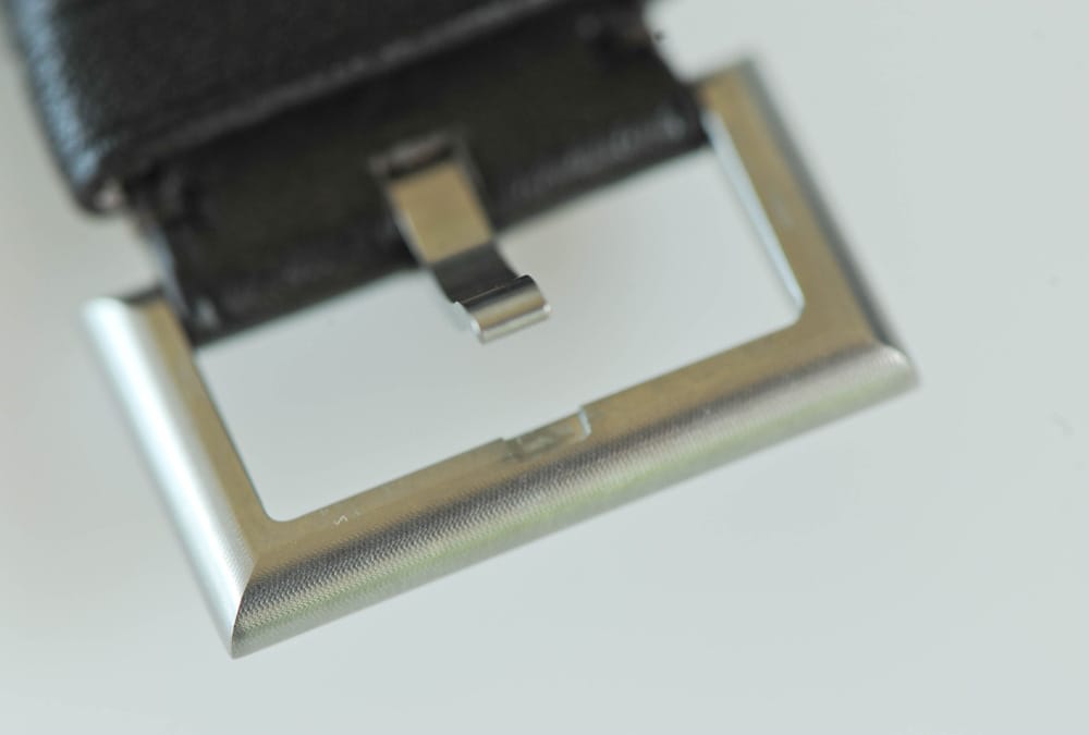
Surfaces can also communicate the brand. Visible traces of the machining, every detail expressing the philosophy, authenticity and origins of the watches.
You can see exactly what we’re trying to achieve with the ochs und junior brand. Functional, great-looking and intelligent watches for those who want to use them. For those for whom a logo is unimportant – who prefer the subtle language of the design to do the talking. Sure, it’s a niche, but it’s growing! ochs und junior is either loved or it’s not – there’s no halfway, and that’s good.
Is ochs und junior design? Maybe! The great thing is, that Oechslin hasn’t had to look for it.
It has emerged from the simplicity of the solution, from the high degree of functionality. A watch from Ludwig Oechslin can only look the way it looks… logically logical. And now: everyone can have his or her colour! The tinta series is very flexible in that respect – no matter what dial and hand/index colours are chosen, the watch remains clearly an ochs und junior…We’re risking nothing 🙂
What we like best about our work is the fact that we touch people. We’ve been presented with that wonderful work Das Bauhaus by Hans M. Wingler; we’ve received a Japanese wabi-sabi vase and a book on the concept; lovely people like Edgar post their new ochs und junior on Facebook. And Ludwig’s spiral date indication came as the result of an observation made by a friend from Geneva (who also pointed out to us about how bad we were at French!). I’m now off on a two-week break with a warm feeling in my heart 🙂
My thanks to all our ochs friends wherever they are! One more thing:
We noticed with the MIH Uhr watch, and now with ochs und junior, that a get-together of all these ochs-wearing friends would no doubt generate a vast amount of creativity and useful feedback and ideas. Fascinating people with fascinating stories. And because MIH and ochs und junior watches can only be bought direct, we know most of the wearers personally… Is that a luxury or what!! 🙂